
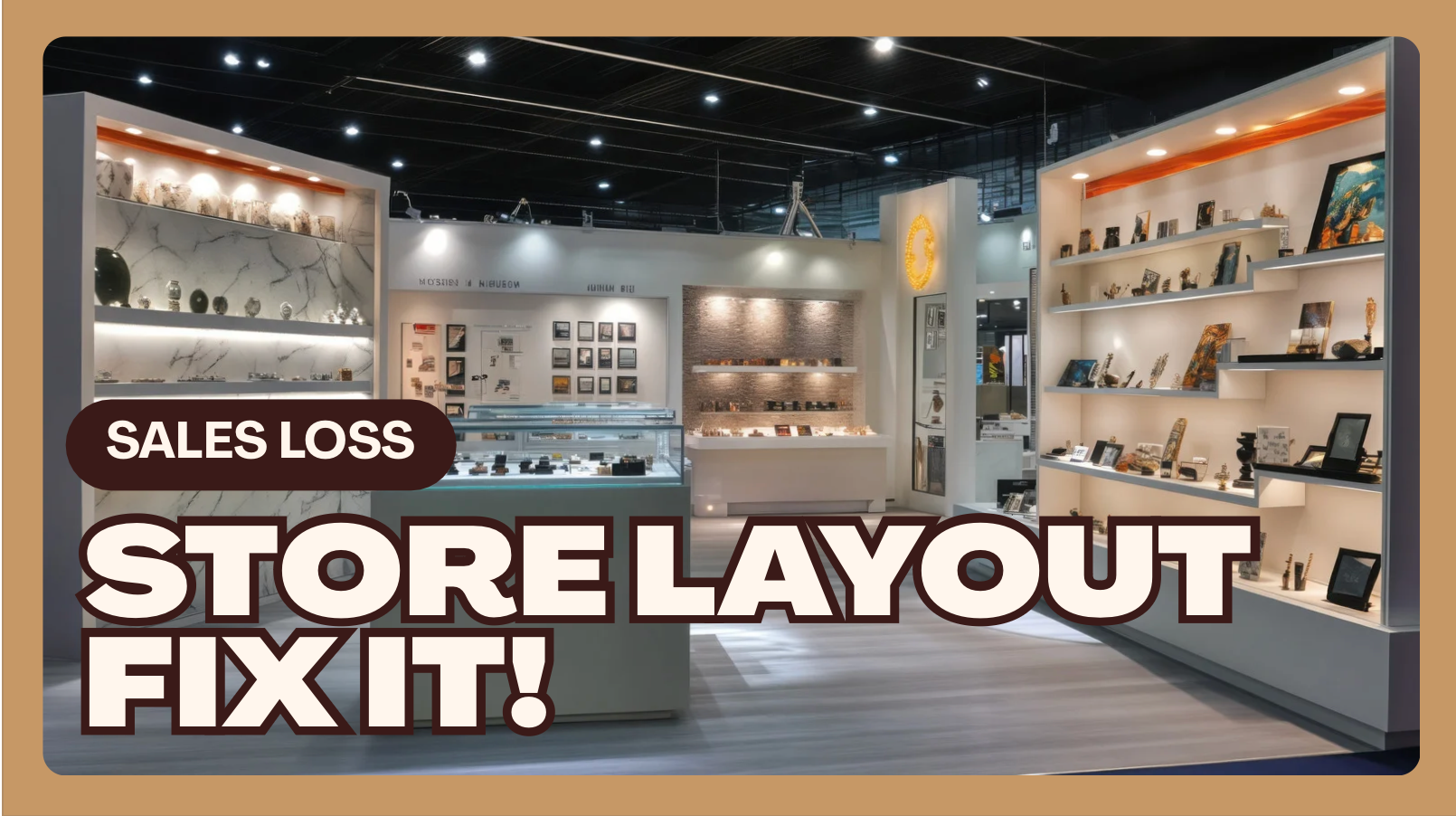
Let’s get real. Most smoke shops are leaving money on the floor — literally. You walk in, and the layout looks like somebody pushed a few glass cases around, threw a rug down, and called it “done.” No strategy. No flow. No direction. Just chaos and wasted opportunity.
Your layout isn’t just decoration — it’s your silent salesman. And right now, that salesman is asleep at the counter.
I’ve walked through hundreds of smoke shops across the country, and I can tell you: nine out of ten are losing sales not because of bad product, not because of bad staff — but because of bad layout.
Let’s fix that.
1. Your Floor Plan Is Your Profit Map
Every inch of your store should have a purpose. Every shelf, every display, every counter should be strategically placed to control customer movement and focus attention where you make the most money.
There are two types of stores in this business:
-
Layout Thinkers: These are the shops that plan flow, measure conversion zones, and tweak weekly.
-
Layout Guessers: These are the shops that move something once and call it good for five years.
Guessers lose. Always.
The Fix:
Design your layout around three goals:
-
Maximize Exposure – Every customer should naturally pass by your top 10 margin drivers.
-
Control Flow – Guide them through a “path” that increases dwell time and product visibility.
-
Create a Journey – The store should tell a story as they walk — from essential to impulse.
Pro tip:
If your customers can walk in, grab their blunt wraps, and leave without ever seeing your premium glass or new arrivals, your layout is failing. Period.
If your customers can walk in, grab their blunt wraps, and leave without ever seeing your premium glass or new arrivals, your layout is failing. Period.
2. Glass Isn’t a Museum — It’s a Magnet
Too many owners treat their glass cases like trophies. They put them against the back wall, light them poorly, and never change the setup. That’s a mistake.
Glass is the heartbeat of a smoke shop. It’s visual. It’s vibrant. It draws people in.
Where It Should Be:
-
Place your best glass display slightly off-center near the middle of the shop — not at the very back.
-
Use angled cases that invite approach from both sides.
-
Layer small-to-large pieces so customers’ eyes move naturally upward.
-
Keep it clean and bright — dusty glass is dead glass.
Bonus Tip:
Rotate one standout piece every week — something eye-catching or premium — and put a small “Feature of the Week” card on it. You’d be shocked how often that one prop triggers sales across the entire case.
3. The Register Isn’t Just for Checkout — It’s for Add-Ons
Your register area is the highest-value real estate in your entire store. If you’re using it for gum and stickers, you’re missing the point.
The register zone is your impulse zone. It’s where you make your easy money.
What Belongs at the Counter:
-
Lighters, torches, and clipper displays.
-
Grinder cards and small pipes under $15.
-
Rolling trays, papers, tips, wraps — keep a variety, not a pile.
-
Detox shots, one-hitter chillums, and novelty keychains.
You want your customers to grab one more thing without thinking.
Pro tip:
Place a single premium glass item behind the counter where customers can see it but can’t grab it. It creates curiosity and a conversation starter every single time.
Place a single premium glass item behind the counter where customers can see it but can’t grab it. It creates curiosity and a conversation starter every single time.
4. Your Traffic Flow Is Broken
If your customers walk in, make a U-turn, and leave — that’s not them being indecisive, that’s your layout confusing them.
A great layout moves people through the store naturally. It guides them without signs, ropes, or barking employees.
Best Practices:
-
Create a clockwise flow (most people turn right when entering).
-
Use low fixtures near the entrance so the space feels open and inviting.
-
Put your register on the left side of the exit (so people finish on that side).
-
Keep your new arrivals or trending section just inside the entrance — customers’ eyes land there first.
Test this:
Stand at your front door and watch five customers. Do they walk the path you want them to? If not, it’s time to reconfigure.
Stand at your front door and watch five customers. Do they walk the path you want them to? If not, it’s time to reconfigure.
5. Lighting — The Underrated Sales Tool
Bad lighting kills more sales than bad pricing ever could.
I’ve seen shops where the vibe is darker than a nightclub, and they wonder why their glass isn’t selling.
I’ve seen shops where the vibe is darker than a nightclub, and they wonder why their glass isn’t selling.
Customers don’t buy what they can’t see.
Fix Your Lighting in Three Steps:
-
Front Windows: Keep them clean and clear. Use daylight LED strips to make your window products pop.
-
Overhead Lights: Go bright white, not yellow. Customers perceive bright as clean and professional.
-
Accent Lights: Add small LED strips under your glass shelves — it’ll make even mid-grade glass look high-end.
Lighting is cheap ROI. A $200 upgrade can make a $20 pipe look like a $60 one.
6. Dead Zones = Dead Profits
Walk your store at 10 a.m., 2 p.m., and 8 p.m.
Where do people never go? That’s a dead zone.
Where do people never go? That’s a dead zone.
Usually, it’s a dark corner, a cluttered aisle, or an area blocked by something oversized. Those dead spots suck energy from your store and drain potential sales.
Fix the Dead Zones:
-
Move promotional displays into those areas temporarily.
-
Add lighting, mirrors, or floor mats to draw attention.
-
Change the product category — turn a weak area into a feature corner.
Every square foot in your store is rent you’re paying. Make it earn its keep.
7. Signage That Sells (Not Screams)
You’ve seen those shops plastered with handwritten signs — “NO RETURNS,” “CASH ONLY,” “DON’T TOUCH.”
You might as well hang a sign that says, “We don’t trust our customers.”
You might as well hang a sign that says, “We don’t trust our customers.”
Do This Instead:
-
Use clean, printed signage.
-
Keep the tone professional and friendly.
-
Highlight promotions and product education instead of rules.
Examples:
-
 “Ask about our new glass line — hand-blown locally!”
 -
“Buy any 3 wraps, get 1 free — this week only!”
Signs should sell, not scold.
8. Seasonal Layout Changes = Free Marketing
You don’t have to run ads every week — sometimes a simple layout refresh does the job.
Rearrange your store quarterly. Highlight different categories seasonally — detox in January, festival gear in summer, incense in fall, gift bundles during holidays.
It keeps your regulars curious. If your store always looks the same, it becomes invisible.
Pro tip:
When customers say, “Oh, you got new stuff in?” — even if it’s not new — that’s when your layout is working.
When customers say, “Oh, you got new stuff in?” — even if it’s not new — that’s when your layout is working.
9. Use Your Walls
Vertical space is money.
If your walls are blank, you’re missing storage, branding, and visual pull.
If your walls are blank, you’re missing storage, branding, and visual pull.
Use slatwall, pegboard, or floating shelves for smaller items like grinders, accessories, and novelty gear. Add brand banners or LED logo lights — it builds atmosphere without clutter.
A wall can tell your story before you even speak.
10. Track the Impact
Here’s what separates real operators from amateurs: tracking.
Don’t just rearrange and “hope.” Watch the data.
Don’t just rearrange and “hope.” Watch the data.
After any major layout change, track:
-
Average transaction size
-
Dwell time (how long people stay)
-
Foot traffic flow (which zones get more attention)
-
SKU velocity (which products move faster)
If numbers go up, keep it. If they don’t, move it again. The best stores evolve.
Final Word: Your Store Should Sell Even When You’re Not There
A winning layout makes money on autopilot.
It guides, it tempts, it sells.
It guides, it tempts, it sells.
You built your smoke shop to make money — not to babysit a bad setup. So stop blaming slow weeks or “cheap customers.” Start looking at your floor.
That’s where your profit leaks are hiding.
Rebuild your layout. Reclaim your margins.
And if you need help mapping that out — well, that’s what ChadWadeTV.com is for.
And if you need help mapping that out — well, that’s what ChadWadeTV.com is for.
Because at the end of the day…
Most shops aren’t failing. They’re just laid out wrong.
Most shops aren’t failing. They’re just laid out wrong.